Friday, March 25, 2016

Is the S&P 500 Poised for Another Fall?

As has been pointed out by the Silver Doctors and others, the S&P 500 has retraced the path it took after its 11.2% plunge in August.

Visit StockCharts.com to see more great charts.

(Updated chart)

Naturally, the question becomes: Is history about to repeat itself? Is the S&P 500 in a big, ranging market?

Some developments that add to the bear case:

Fed officials back talking about rate hikes again -- this time in April -- after blinking at the March FOMC meeting AND lowerign their forecast for the number of rate hikes this year.

Also, as the Wall Street Journal tells us, "Corporate profits after tax, without inventory valuation and capital consumption adjustments, fell at an 8.1% pace last quarter from the third. That was largest quarterly decline since the first quarter of 2011. Profits fell 3.3% in third quarter from the second. On a year-over-year basis, corporate profits declined 3.6% in the fourth quarter."

U.S. GDP growth came in at 1.4% in the fourth quarter. That's pretty anemic, but it also might be the new normal.

One more chart. This is of forward S&P 500 earnings.

Is the S&P 500 overpriced? I don't know. But it's certainly not cheap. 

Don't worry too much about this over the weekend. Have a wonderful Easter.


Sunday, March 20, 2016

Coming to Make-or-Break Time for S&P 500

Here's an update on a chart that I've been following since January 15 on this blog and on InvestmentU.com before that. You can see that the S&P 500 is coming up to strong overhead resistance.Visit StockCharts.com to see more great charts.
(Updated chart)

What happens there is anybody's guess. It's good to see that strength in the market is broadening; maybe that's what the S&P 500 needs to push higher. But we are approaching what has been overhead resistance since the start of 2015.

Strength broadens in the NYSE

Something from the Stockcharts Chartwatchers newsletter that I thought I would share with you.
NYSE New Highs ($NYHGH) exceeded 250 for the first time since March 2015. This means the rally is broadening within the NYSE as more stocks record new highs. Utilities, consumer staples, industrials and REITs accounted for most of the new highs.
Visit StockCharts.com to see more great charts.
We are also seeing the percentage of NYSE stocks trading above their 200-day moving average moving up to challenge the fourth quarter high around 40% after bottoming in January in oversold territory below 20%.

Monday, March 14, 2016

One of the Biggest Bargains in Biotech Looks Bullish Here

Gilead Sciences ($GILD) has been a bargain for quite some time. This company apparently does not know what to do with its piles o' money, and it pays a nice dividend. Now, its chart is starting to look very good.

Visit StockCharts.com to see more great charts.

(Updated chart)

Gilead just popped above its 50-day moving average. And it looks ready to break out of that ascending triangle. All on a down-day for the market. 

I guess we'll see if this chart pattern works out.


GDX -- The Big Trend Has Changed

I wanted to post the monthly chart of the Market Vectors Gold Miners (GDX) that went with my recent InvestmentU.com story ("The Most Bullish Gold Chart You'll See All Year") that ran on March 8th.

InvestmentU.com prefers line charts, I prefer candlestick charts. So, here's the candlestick chart version for later reference.

Visit StockCharts.com to see more great charts.
(Updated chart)

This chart shouldn't change too quickly, being a monthly chart. It is very bullish.

Good luck to us all.


Saturday, March 5, 2016

Keep Your Eye on this Gold Chart

I gave Oxford Club Chairman Circle members a briefing on gold this past week, aboard the Crystal Symphony. It's time for an updated chart.


This is a chart of the price of gold through Friday. By the numbers ...

1. We can see that gold broke out of a bull pennant pattern. On Thursday, it closed at $1264.90. That is above the top of the "flagpole" that the pennant flies on -- that top being $1263.90. So, that's very bullish. This can be seen as confirmation of the bullish pennant. And that would give us a price target of $1,386.

However, the next day, Friday, gold closed lower at $1,260.10. So we do not have a weekly confirmation of the breakout. I'd consider this bull pennant half-hearted (for now).

2. The 50-day moving average crossed above the 200-day moving average. The question now is, "is the 200-day moving average rising?" That's not as simple a question as you might think. It all depends on how you compute the 200-day simple moving average. And there is nothing simple about a simple moving average.

Bloomberg computes the 200-day MA as rising. Stockcharts does not. Finviz agrees with Bloomberg, at least on the GLD

Do you see how confusing technical analysis can be? And the question is important, because a "golden cross", an important technical signal, occurs only when both the 50-day and 200-day moving averages are rising.

I think we'll call this one a "maybe."

3. There was strong "sell" volume on Friday. I think this is traders positioning themselves for a potential pullback next week. Still, not a confirmation of the bullish move.

4. RSI, a measure of momentum, fails to confirm the bullish move.

5. Aroon showed that gold's bullish trend started in early January. That trend remains in place until proven otherwise.

My take-away from all this is that we haven't seen a clear breakout in gold yet. I think we could be in for a pullback/correction to the dominant bullish trend.

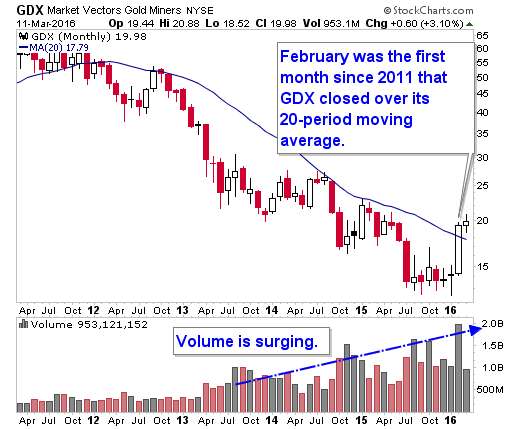
One interesting note: The Prospectors & Dealer's Association of Canada (PDAC), the biggest mining conference in the world, is going on right now. It ends March 9th. Usually, mining stocks (including gold miners) sell off after the conference ends. So perhaps we'll see weakness until that runs its course.

But overall, I think both the trend and recent action in gold is very positive. I would view pullbacks as buying opportunities.